
Creating a Dissolution Graph in GraphPad Prism
GraphPad Prism is a powerful software tool widely used for scientific and statistical analysis. It offers a range of features for creating different types of graphs, including dissolution graphs. A dissolution graph displays the rate at which a substance dissolves in a liquid over a period of time. This type of graph is commonly used in pharmaceutical research to analyze the dissolution behavior of tablets, capsules, and other solid dosage forms. In this article, we will guide you through the process of creating a dissolution graph in GraphPad Prism.
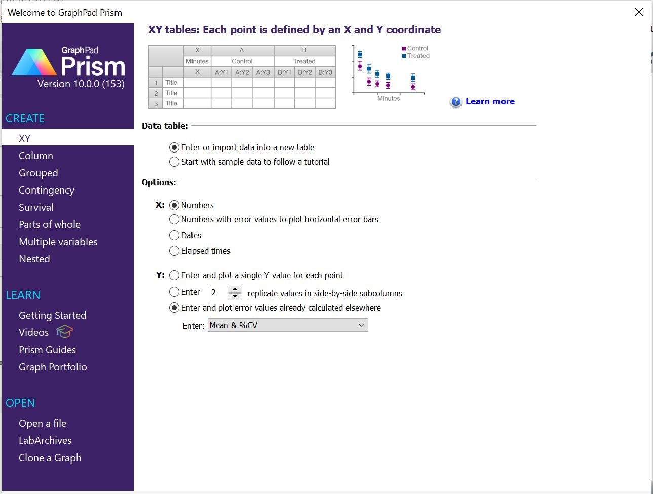
Step 1: Open GraphPad Prism and Select Table Type
Launch GraphPad Prism and create a new graph.
Choose the “XY” option under the “CREATE” tab. Dissolution graphs are essentially scatter plots of time vs. dissolution percentage.
Under “Data table”, select “Enter or input data into a new table”.
Under “Options”, select “Numbers” as X and for Y, select “Enter and plot error values already calculated elsewhere”. Click on the dropdown and select Mean and % CV.
Step 2: Enter Data
Go to the "Data" tab and input your dissolution data.
Enter your time points in the first column and the corresponding mean dissolution percentages and % CV values in the following columns.

Step 3: Choose the Graph Type
Once you've entered your data, you can select a graph type. For dissolution, it would be best to include points, connecting lines, and error bars.

Step 4: Customize the Graph
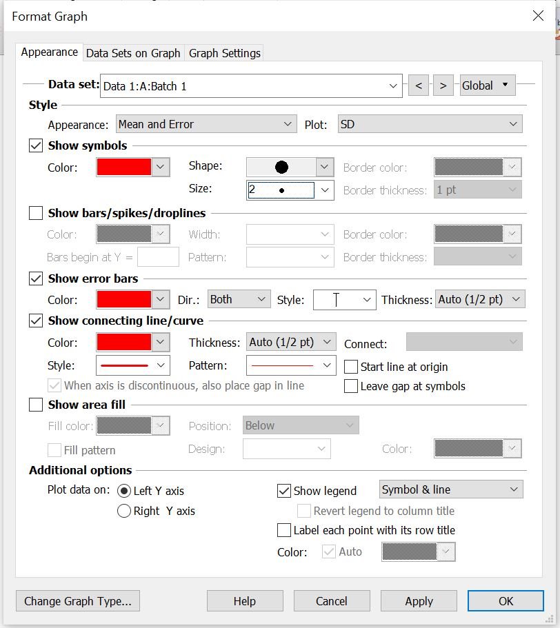
Once you've created the basic dissolution graph as shown below, you can customize it to make it more informative and visually appealing.

Titles and Labels: Add a title to your graph and label the X and Y axes appropriately. For example, the X-axis could be labeled "Time (min)" and the Y-axis could be labeled "% Dissolved". The graph title and axes labels can be edited by simply double clicking on them.
Data Points: Customize the appearance of data points. You can change the symbol style, size, and color to differentiate between different formulations in the “Format Graph” window that pops up when you double click on any point in the line.
Formatting: Adjust fonts, colors, line styles, and other formatting options to enhance the overall appearance of the graph. Switch between the different data sets and format them individually in the “Data set” dropdown.
Tip: If the error bars are not visible, it could be because the symbol used for the data points is covering them, particularly if the error is small. To make the error bars visible, try reducing the size of the symbol. In this example, the symbol size is set to 2.
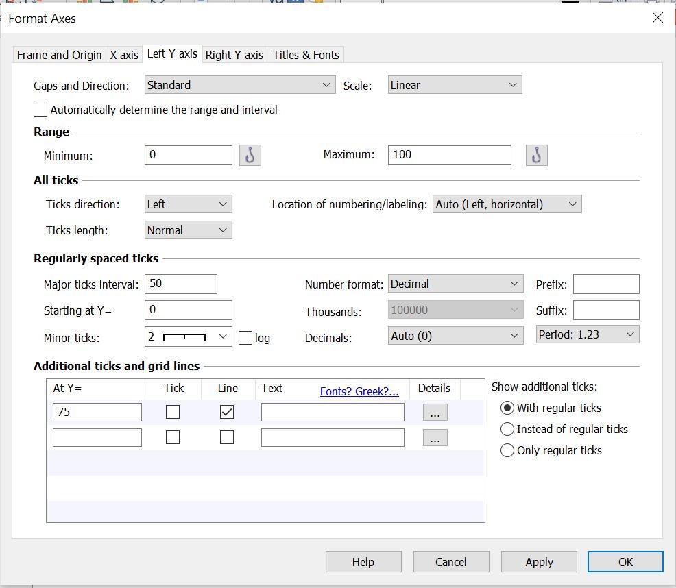
Step 5: Add Grid Lines
Consider adding grid lines to represent your Q or the targeted amount of active substance within a certain time. Simply double click on any of the axes and the “Format Axes” window will appear.
In the "Left Y axis" tab, navigate to "Additional ticks and grid lines" where you can specify a value for Y and check the "Line" checkbox.
Similarly, in the "X axis" tab, you can add an X value and select the "Line" checkbox under "Additional ticks and grid lines".

Final Dissolution Graph:
GraphPad Prism's user-friendly interface and powerful graphing capabilities make it an excellent tool for analyzing dissolution data and presenting your findings in a visually appealing manner.
This graph can be utilized in reports, presentations, or regulatory submissions, enhancing their visual impact and effectiveness.

Do you have any questions or suggestions? Feel free to reach us by clicking here.