
Which Type of Chart or Graph is Right for You?
In this article, we will talk about the 4 basic chart or graph types and when to use them.
Anatomy of a Chart:

Most Common Types of Charts and Graphs:
Column Charts
Line Charts
Pie Charts
Scatter (X,Y) Charts
Let’s look at each one more closely!
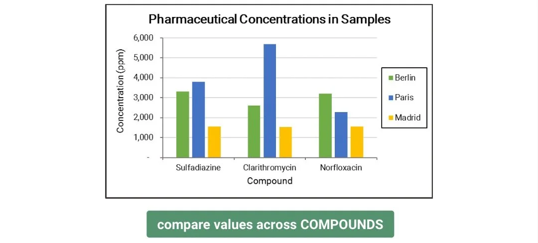
Column Chart
Use column charts to COMPARE values across categories.

A few tips on column charts:
Sort your categories to highlight high vs. low values.

Switch row/column based on the category you are comparing. Click the SWITCH ROW/COLUMN button to flip the categories.

[Download Now: Free Time-Saving Excel Shortcuts]
Types of column charts and when to use them:
Stacked Column - use stacked column if the COMBINED VALUE per category is important for your comparison.

100% Stacked Column - use 100% stacked column to compare %COMPOSITION per category instead of values.

Bar Chart - a bar chart is just a column chart shown horizontally.
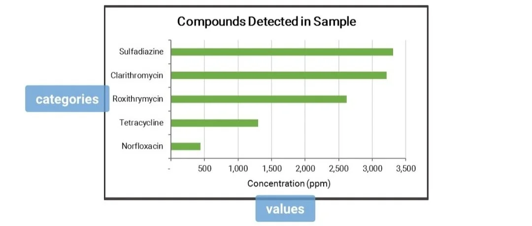
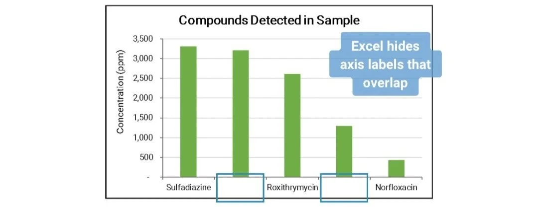
Note: Use bar chart if the axis labels are too long to fit in a column chart.
Line Charts
Use line charts to show TREND or how the values change over time.

[Download Now: Free Time-Saving Excel Shortcuts]
A few tips on line charts:
Plot multiple line charts to compared trends across different categories.

Too many lines make the chart unreadable. Limit to the lines that will highlight your story.

Types of line charts and when to use them:
With Markers - add markers to show exactly where the data points are along the line.

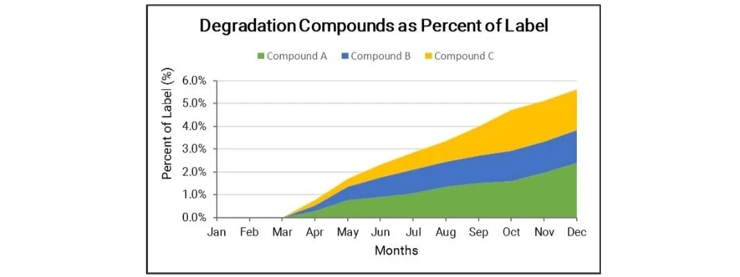
Area Chart - use area chart to emphasize the magnitude of change over time.

Stacked Area - use stacked area to highlight the TOTAL VALUE and to show overall trend.
100% Stacked Area - use 100% stacked area to show the trend of % COMPOSITION.

Pie Charts
Use pie charts to show % COMPOSITION of data across categories.
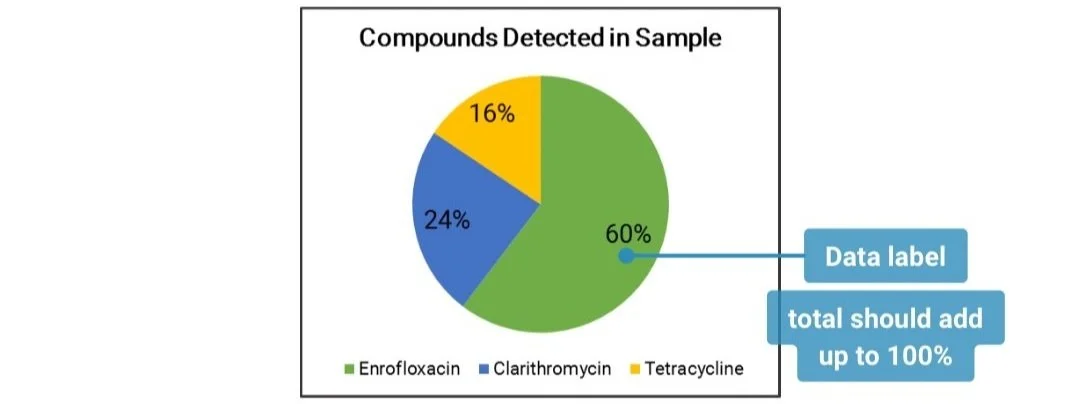
A few tips on pie charts:
Order your categories clockwise, starting with the largest slice from the top.

Too many categories make the chart difficult to read.

Limit the number of slices or combine smaller slices into a new category.

[Download Now: Free Time-Saving Excel Shortcuts]
Types of pie charts and when to use them:
3D Pie Chart - do not use 3D pie charts. Slices may appear smaller or larger than what they should be.

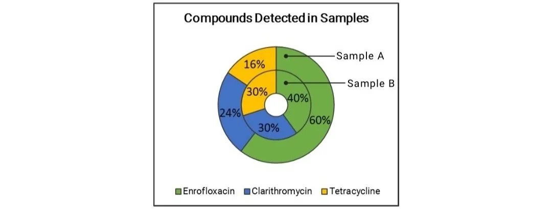
Doughnut Chart - use a doughnut chart to compare % composition between data sets.
Scatter (X,Y) Plots
Use scatter plots to show the relationship or CORRELATION between two variables.

A few tips on scatter plots:
Add a trendline to show the pattern that best explains the relationship of the variables.
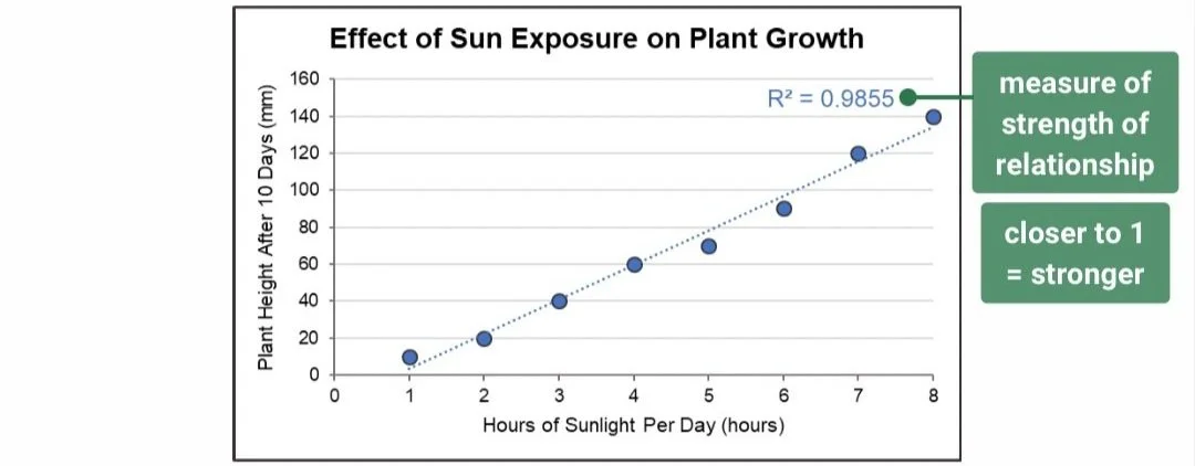
More data points would result to a better fit of a line.

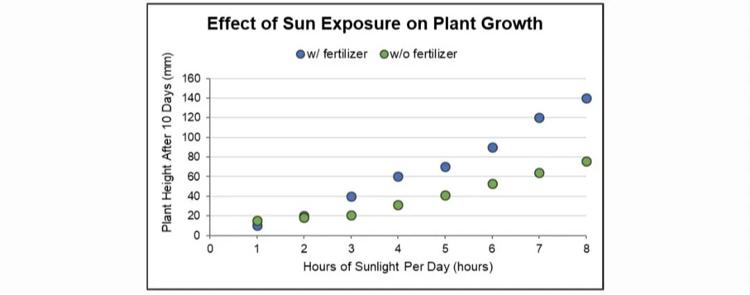
Plot multiple scatter plots to compare correlation between two sets of data.
Do you have any questions or suggestions? Feel free to reach us by clicking here.